
"At the moment all we’re allowed is some hieroglyphics depicting a P, a bed, a knife and fork and so on," complained a suit. "We want to put brands in that space."
The official reason for the outlawing of brand signs all over the motorway is that they might distract drivers.
So far, Saussure
Never mind that, they ought to be banned for aesthetic reasons.
British motorways may be overcrowded, slow, and subjected to constant roadworks, but by thunder we know how to do signs.
British road signs are the most beautiful in the world. Minimal text, maximum efficiency, no sharp edges.
That warm, rounded font can make even the most dismal places seem welcoming...
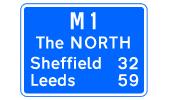
...and convey a complex series of information bytes at a glance (not to mention provide a source of healthy in-car debate)...
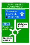
...you don’t see so many of these abroad...

...and who hasn’t spend many a happy mile pondering the physical possibility or otherwise of this little gem:

The Tube Map: Embracing the Abstract
British sign-making reached its apotheosis of course, with the London Tube Map. This is – seriously – perhaps the greatest piece of British design work of the twentieth century
It was created by Harry Beck in 1933. Beck’s genius was to realise that the map could bear only a passing resemblance to geographical reality – and that this would actually make it more useful.
Navigating the Underground is child's play, thanks to Beck’s map. You find your destination, see the line and then it's just a matter of northbound or southbound.
Compare its elegant simplicity with the horrors of the Paris Metro map, which misguidedly attempts to represent physical reality.
So here we have an interesting philosophical point. The French, lovers of the abstract and the ephemeral, fail to create something useful by attempting to be practical.
The down-to-earth British, on the other hand, embrace the abstract to create something practical.
(Incidentally, this is what the London Tube map would look like if it represented physical reality.)
2 comments:
Peter
Thanks - on both counts!
Wow - commenting here is like going back in time.
Post a Comment